TrueCar
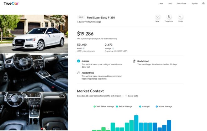
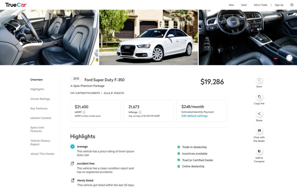
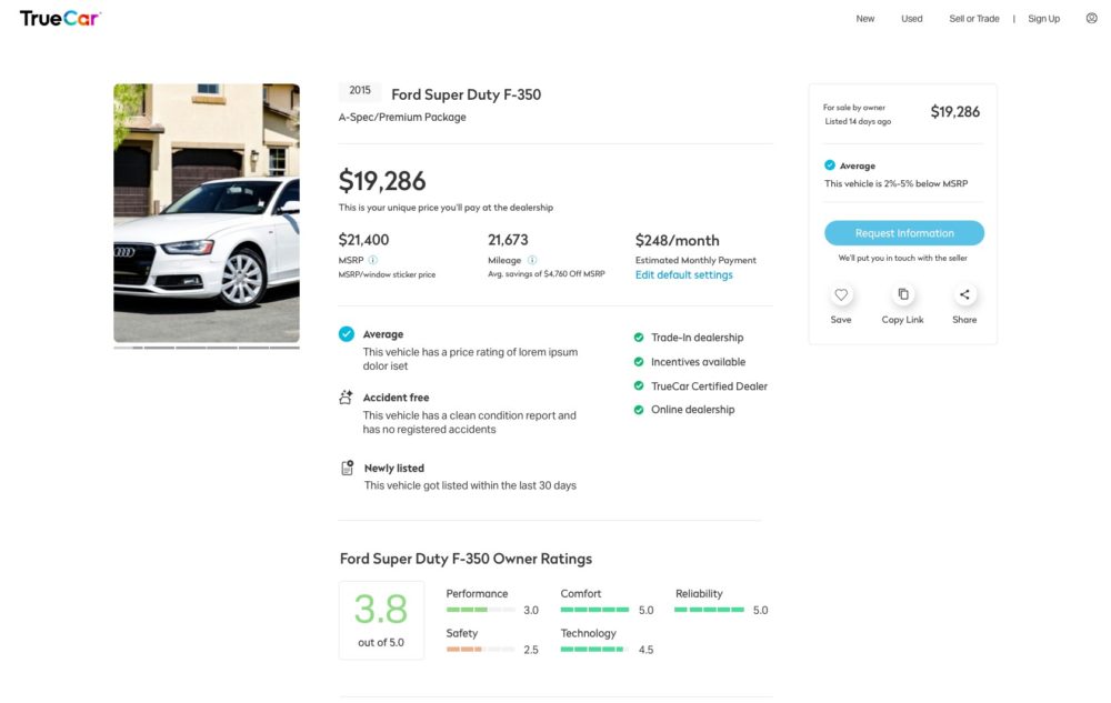
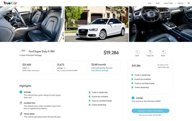
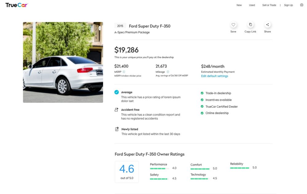
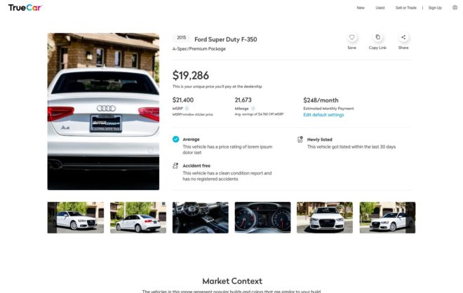
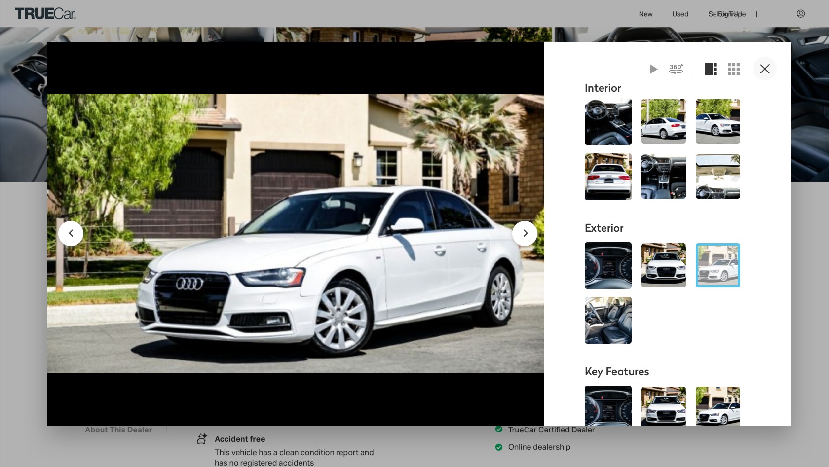
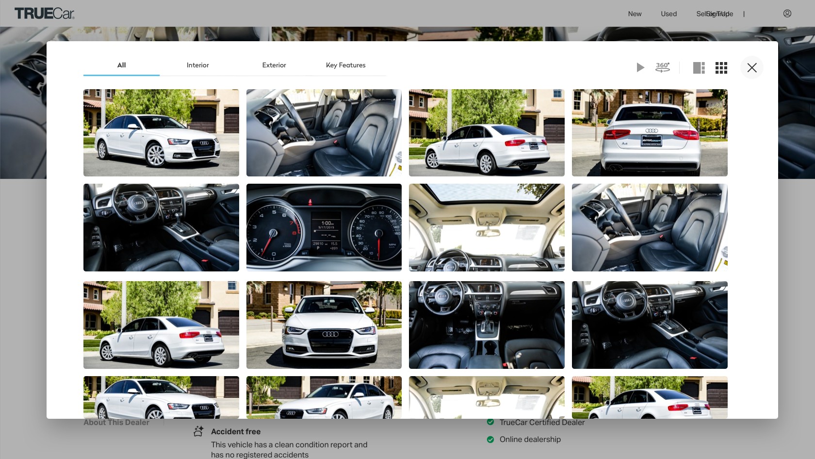
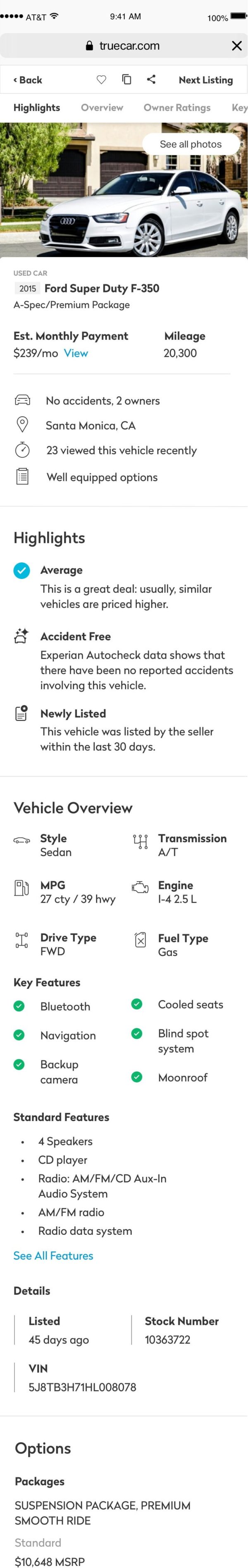
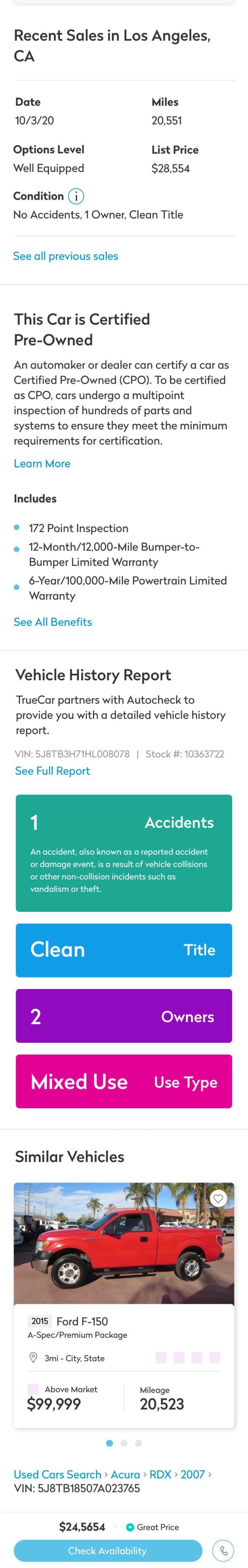
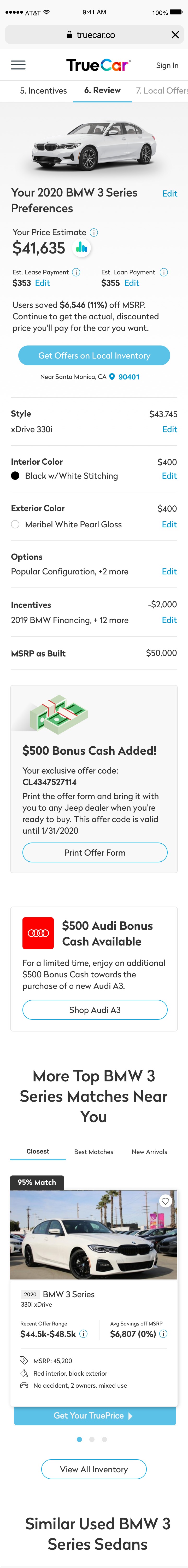
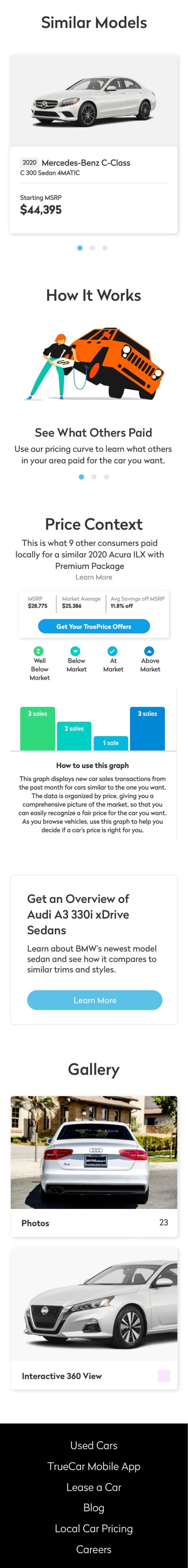
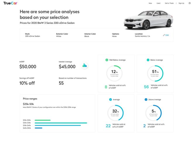
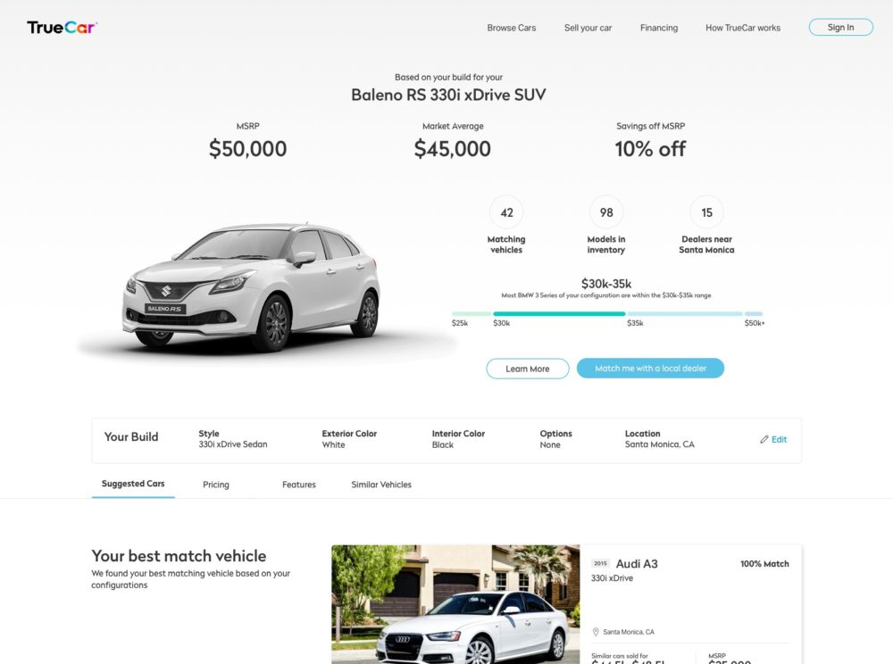
At TrueCar I designed several of our core products in New Cars, Used Cars, and Trade-in which touch on all fronts of our business. On the Used Car product, the vehicle detail page displays all information about the specific VIN, including features, price trends, vehicle report, etc. We modernized the look, added several more modules, and focused on what users cared about the most. I also redesigned our search results page, converting a row layout to a grid layout to display more vehicles, and significantly adding to and improving our filter functions. The search results page and the vehicle detail page are the key components to the Used Marketplace. For the New Car experience, I redesigned the build summary page which focused heavily on getting users to convert. Other efforts include building TrueCar’s sketch UI library from scratch, maintaining the library, and giving workshops to the team on how to design with grids and nested symbols.
Being engaged with all facets of the business meant working with a different product manager and teams. Each of these pages have a lot of user views which meant that the redesign had to carefully consider each stakeholder’s opinions on the requirements and goals.
Multiple iterations paired with user testing help us to get to the final design. After some A/B testing we made additional tweaks to help with conversion. With all our designs we wanted to make sure that it was responsive and mobile friendly.
Product Designer
Automotive
Tech
2018-2020
Sketch, Invision, Invision Studio, UsabilityHub, UserTesting
User Experience
Responsive Design
System Design
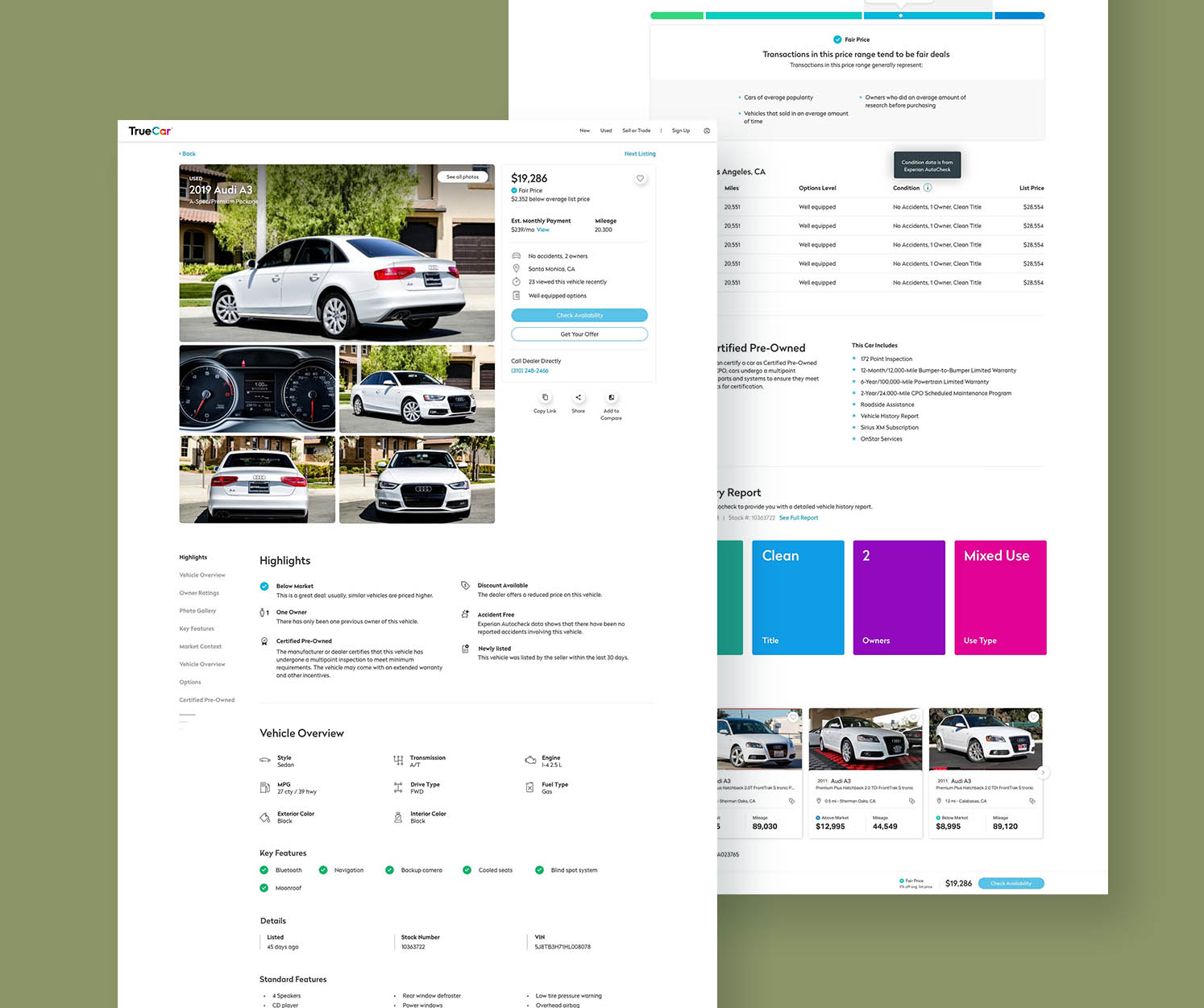
Since the vehicle detail page gets so long, I needed a way for users to quickly navigate to parts of the page that they were interested in. The navigation would be a sticky on the left side as the user scrolled down. Scrolling would automatically move the labels, and clicking on a label would act as a page anchor. However, even with all the section labels it was too long for smaller screens. In this custom sticky navigation, labels that are too long would be hidden beneath the three lines, and appear one by one as the user scrolled. The screen on the left shows the concept of the behavior, and the right screen shows the detailed interaction of lines turning into labels.
As with all projects, there were several iterations that came before the final design of the vehicle detail page. Below are some of the early work in progress options for the general layout and information architecture that didn’t make it. The difficulty in this project was trying to find a layout that fit pertinent information above the fold, having a clear call to action, while still highlighting vehicle images.
favorite question
almost always,
it just stacks
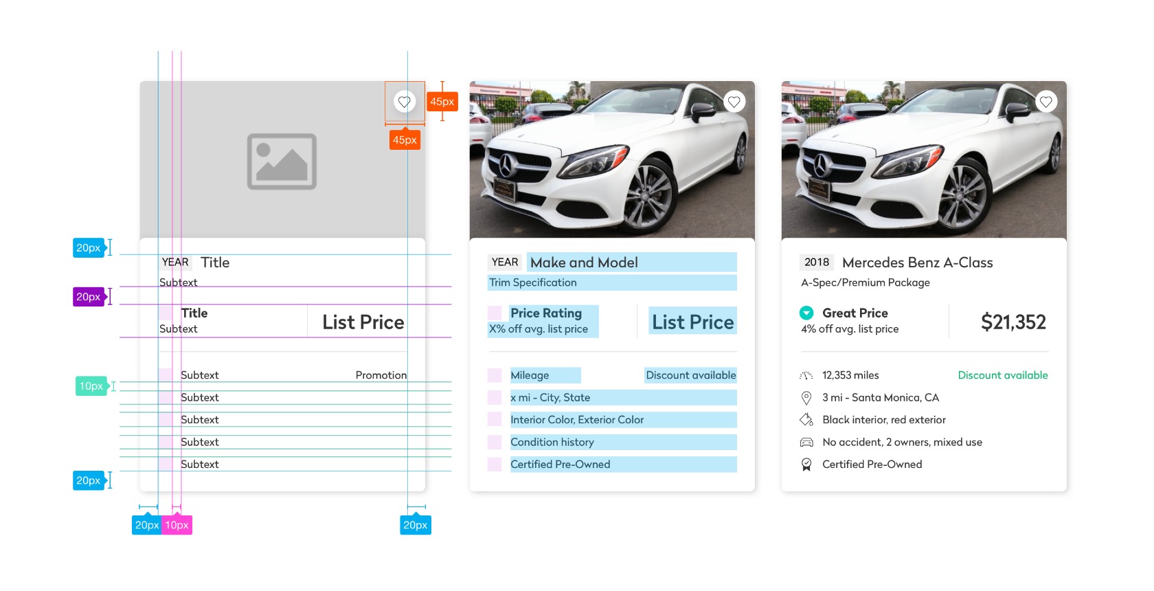
We spent a lot of time testing an interactive multistate vehicle card, where a hover state would trigger more information being shown. These were a few of the options that we considered.
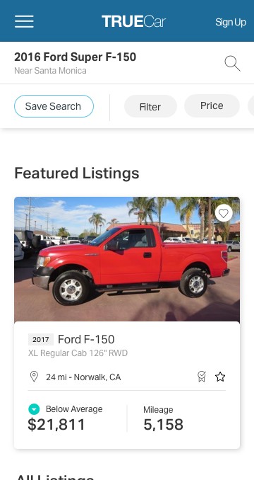
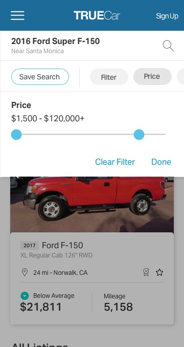
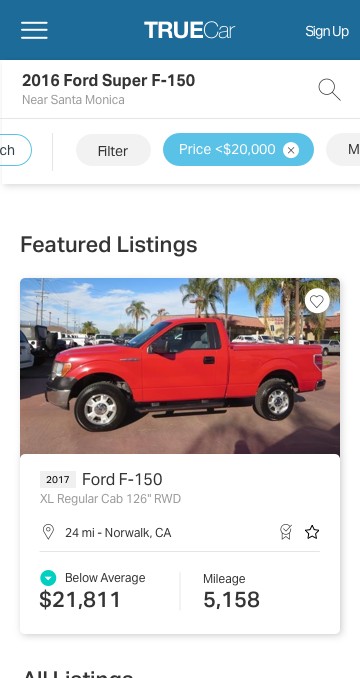
I also redesigned the search results page, which includes the vehicle cards and the filter panel. The filter panel is much more sophisticated in that it will show your selections in a chip as a summary. Interacting with the chips can quickly remove a selected filter when collapsed. Several rounds of A/B testing went into finalizing the vehicle card that worked best for conversions.
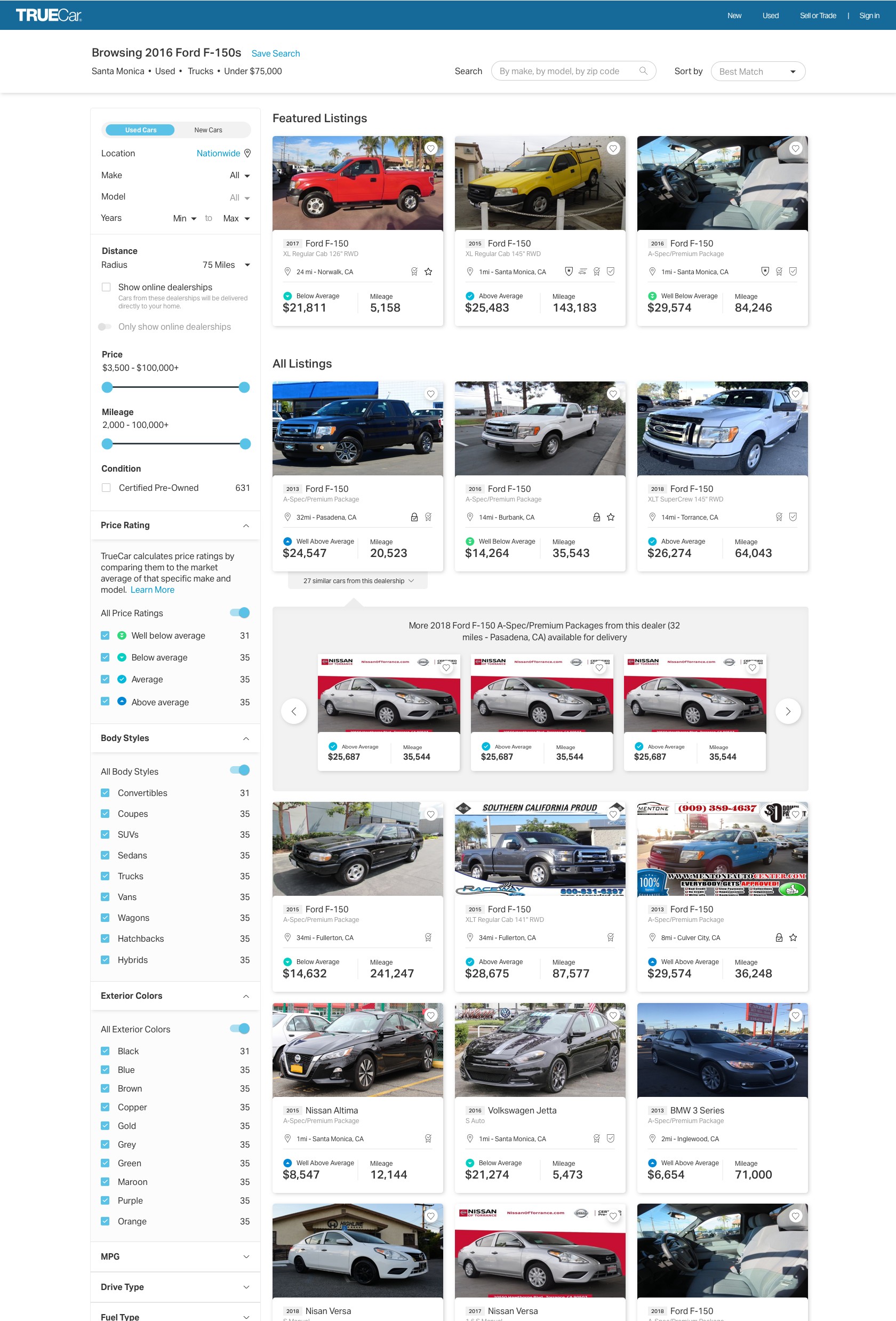
Since filters were such an important aspect of the search experience, we wanted to make the popular filters more accessible instead of hiding them all under one “Filter” button. The quick filters drop a tray which allow you to quickly make a selection, and the selection can be viewed upon save.
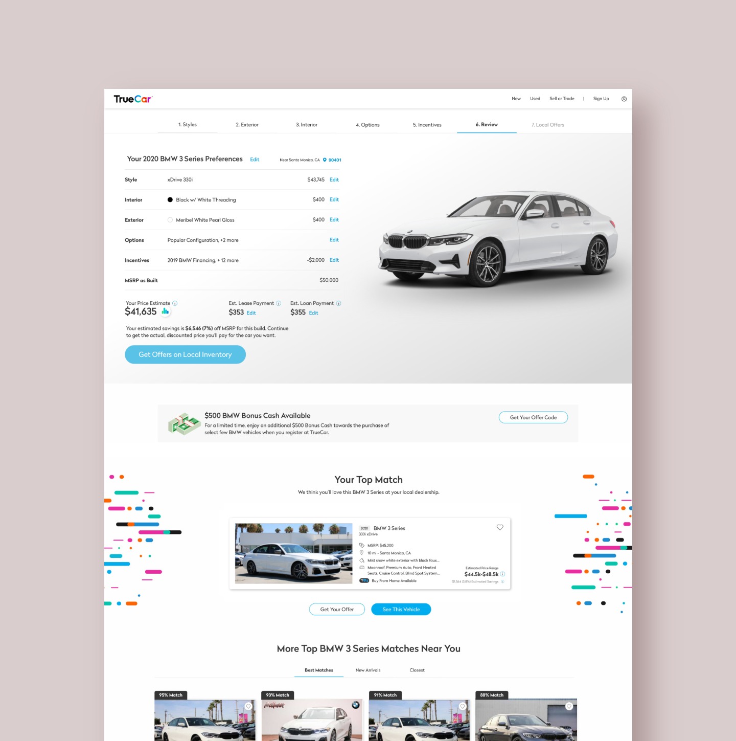
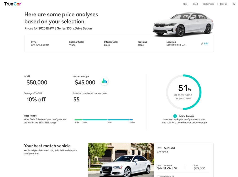
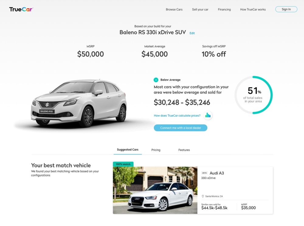
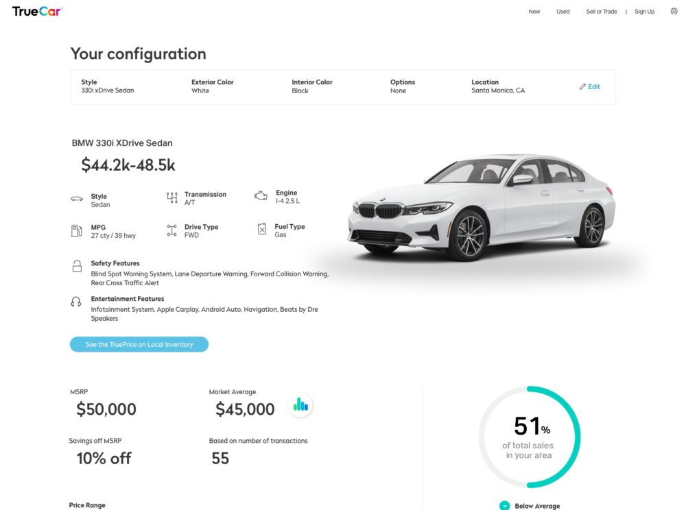
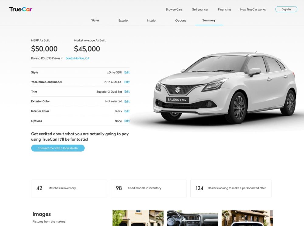
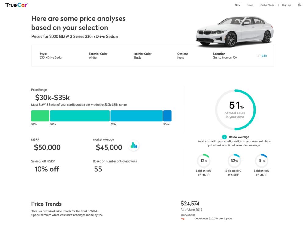
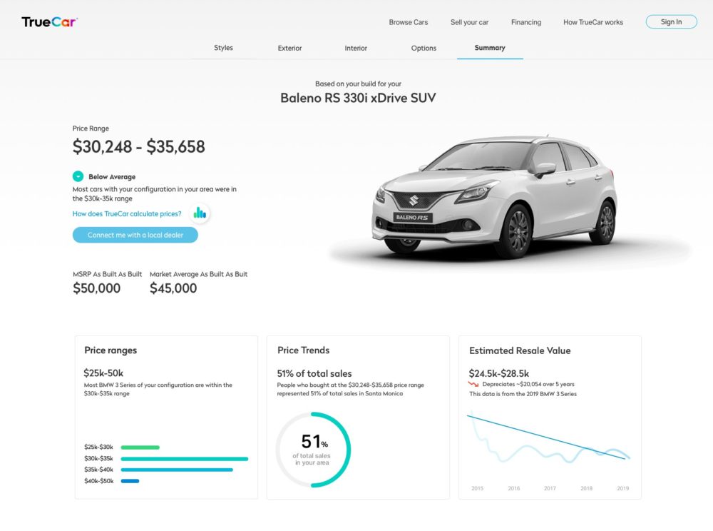
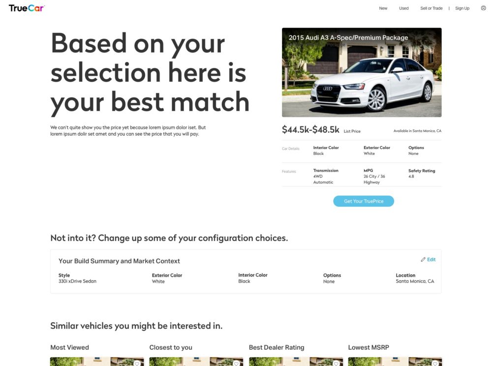
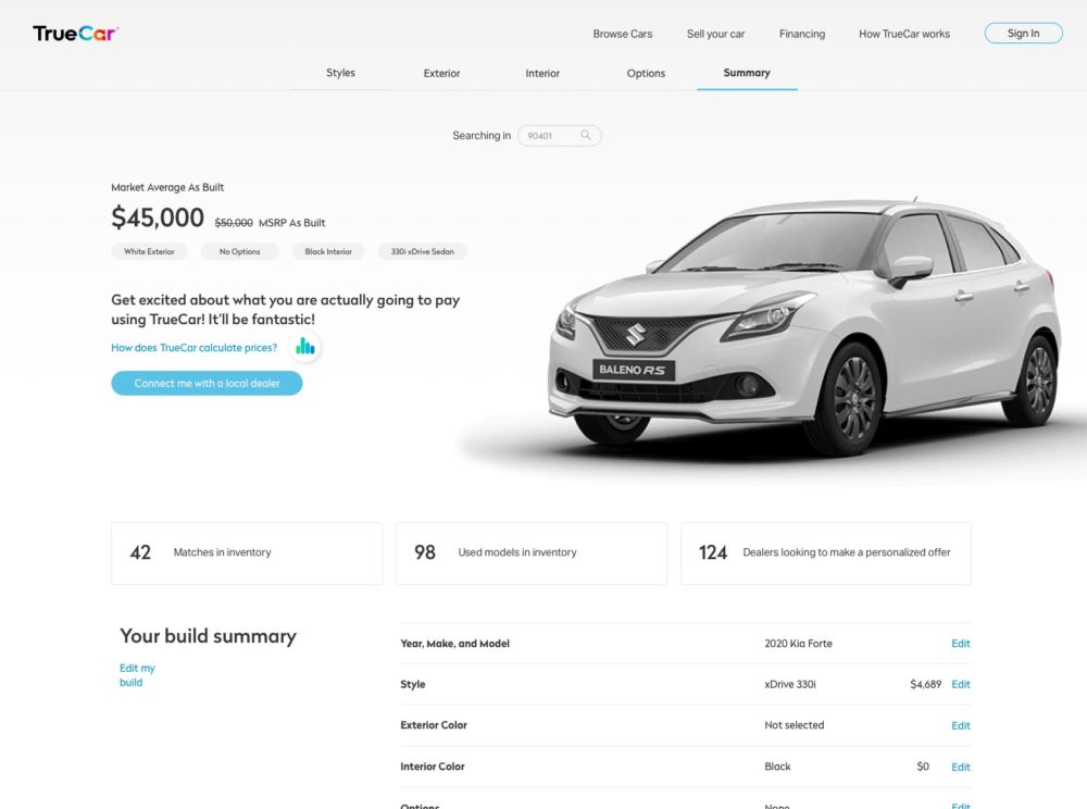
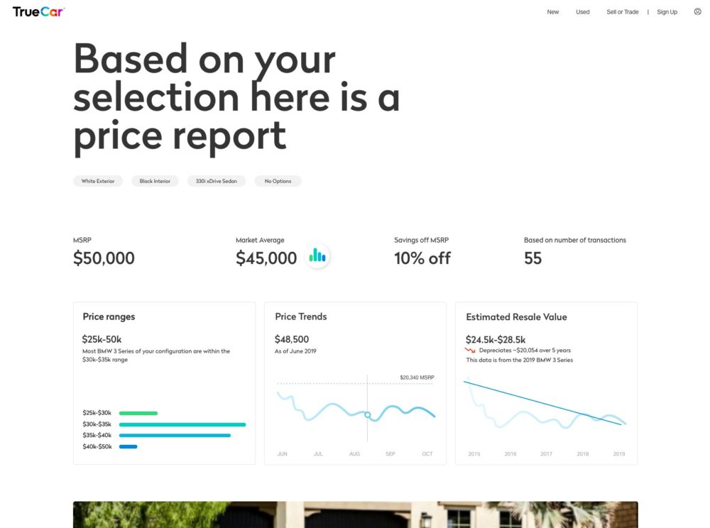
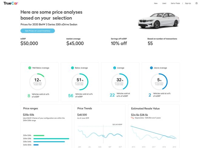
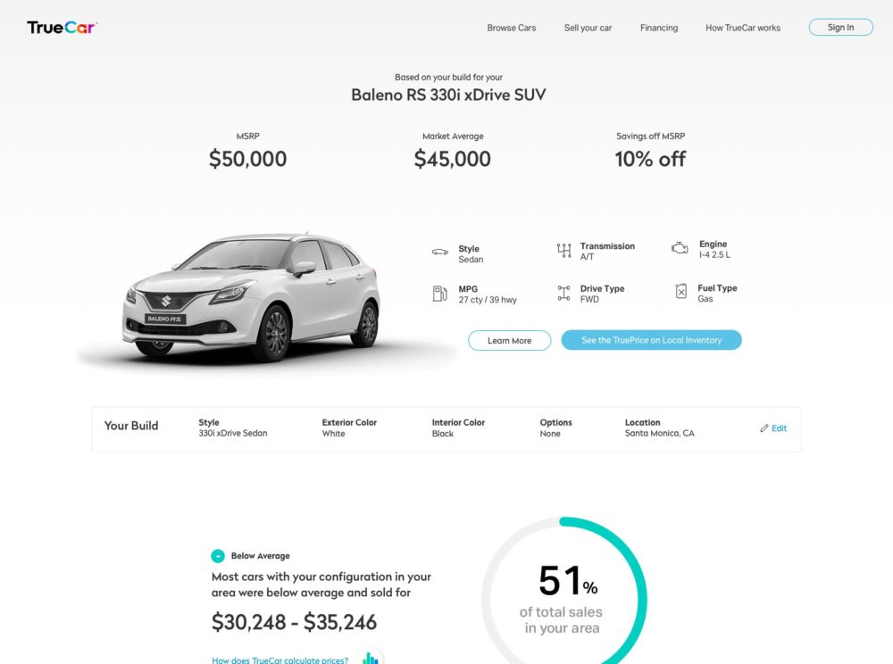
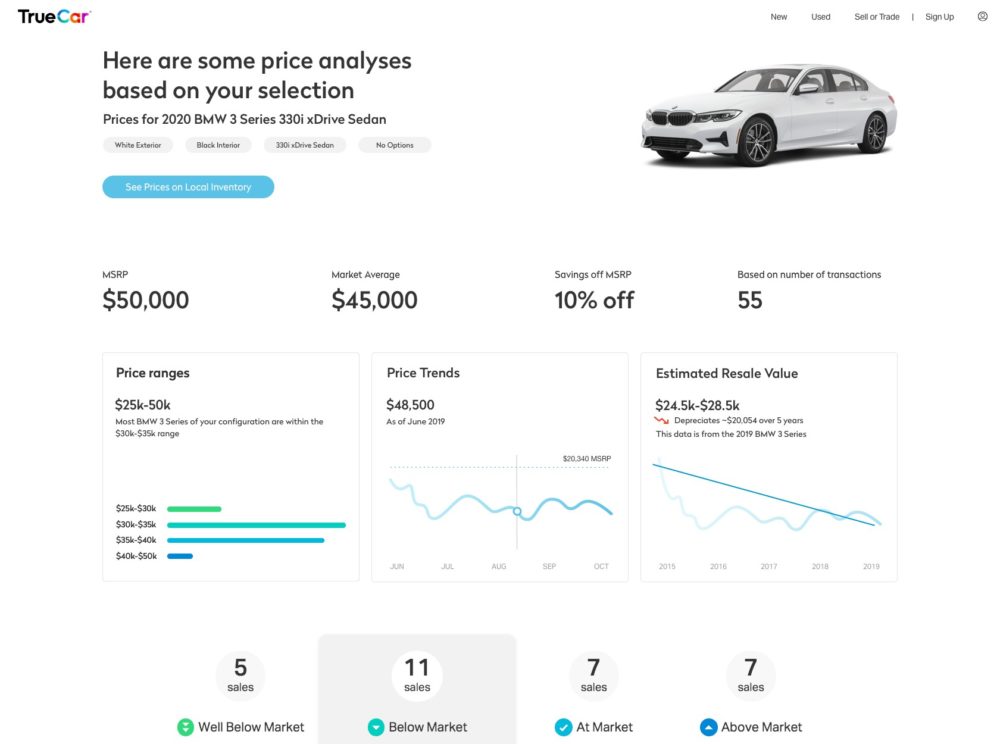
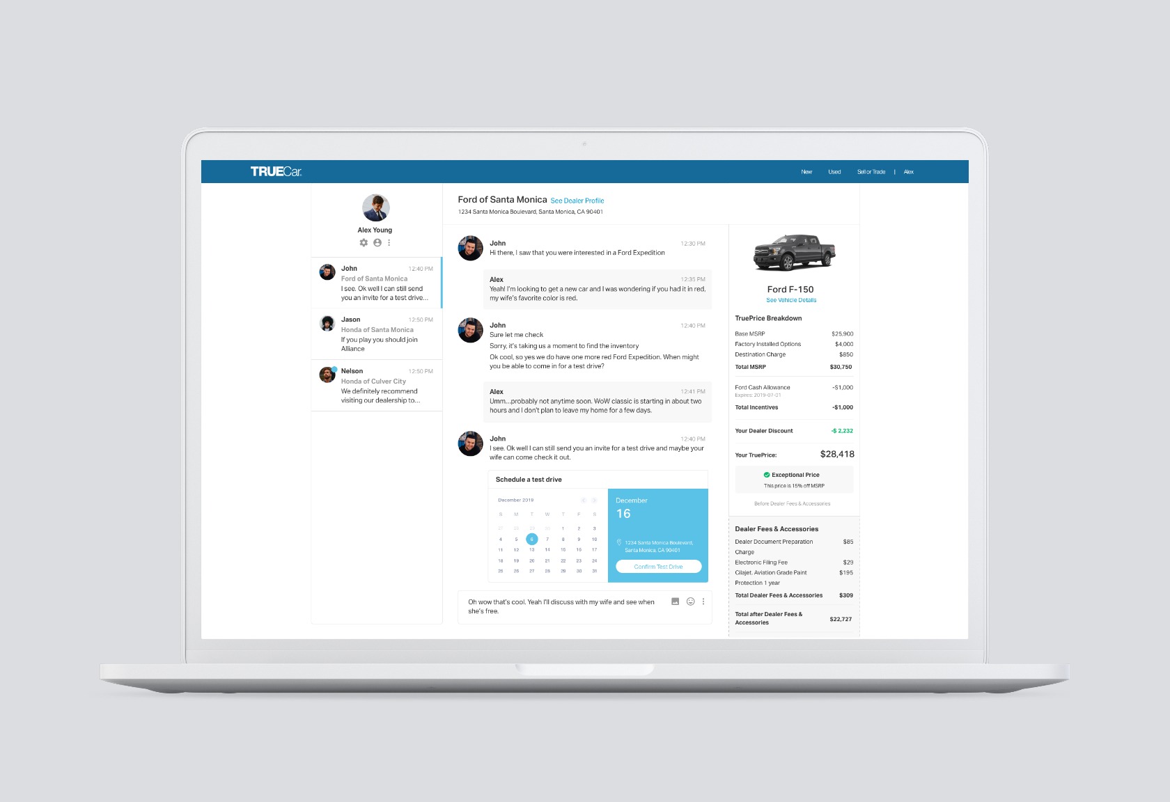
The build summary appears at the end of a configuration flow when the user hits “Shop New” from the home page. It gives the user a summary of their configuration and also a range estimate of how much that specific build might cost. The user is encouraged to prospect and convert from this page to find nearby dealers who would have that configuration.
favorite question
almost always,
it just stacks
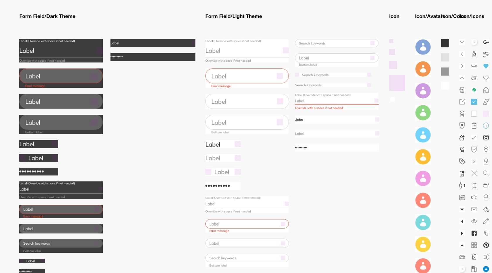
I built TrueCar’s Sketch library from scratch, and used nested symbols so that our designers could quickly swap things out. I also designed the grid system that worked between designers and developers. Having a basic foundation with the grid and an organized library of components has increased everyone’s work efficiency and accuracy.