
So let’s talk a little bit about design process. Visually, people describe me as being a very technical and calculated designer. And as an INTJ, I value designs having logic to their decision making process. Coming from a science background, I try to use logic to determine the best layout or UX solution instead of my personal preferences, and back it up with user testing.
Figma is my tool of choice when it comes to designing responsive websites and mobile apps. From there I may string up the screens into a clickable prototype, and depending on the project I may create animations with Invision Studio, some which you can see on my homepage archive. When it’s all ready, I handoff my designs to developers and include any notes. Throughout the process I like to check myself with user testing via Usability Hub or User Testing, and of course top it off with A/B tests towards the end. My abilities to learn very quickly, and empathize with busy users who have short attention spans, are my top strengths in creating simple and humanistic designs. With everything that I do, I try to follow my own principles of good design — which are, simplicity, functionality, and modularity.
I’m also a power user and like to use a ton of shortcuts, keybindings, macros, etc. I have lots of add-ons to automate my processes, and you can read more about them here.
If you can think it, you can design it
Design is like a math problem; before starting anything it’s imperative to understand what it is you are solving for. That means asking the right questions, like: What is the primary business goal of this project? How do you define success? What are the must haves and nice to haves?
In this phase I am gathering requirements, understanding who the stakeholder is, and who the users are. Sometimes it is necessary to conduct a user survey before starting.
When I start to think about the problems, naturally I break them down into manageable chunks. How do I achieve something with the least amount of clicking? How do I make sure that people will understand this for the first time, every time? And once I understand the problem, I like to think big.
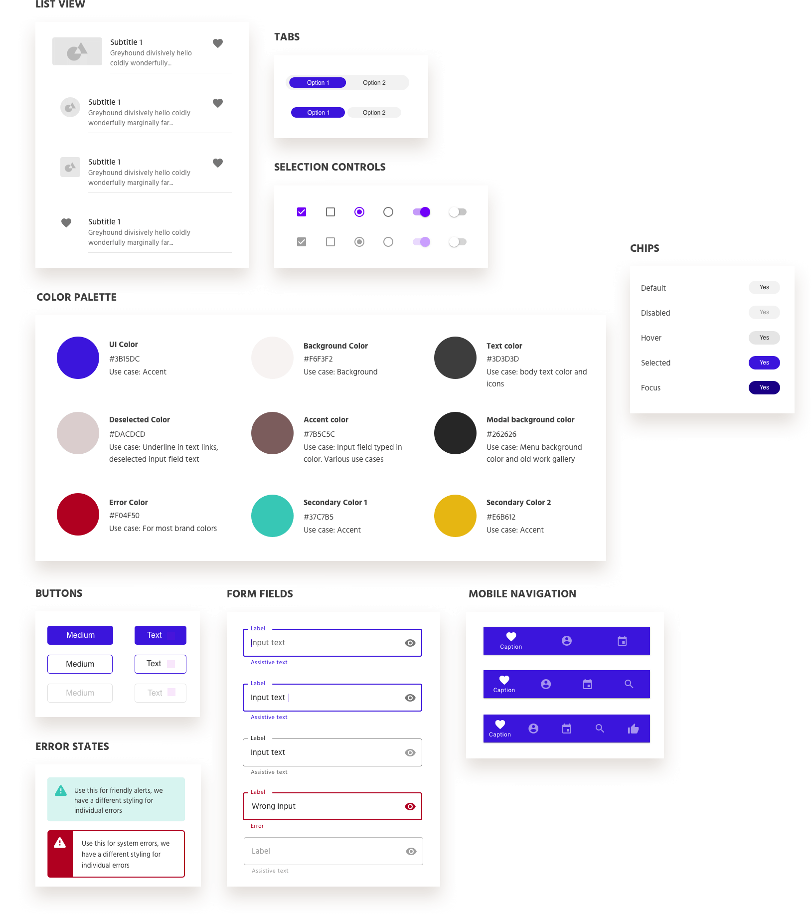
I always design with a grid system and it’s important to my process so I can make sure things are aligned properly, and see to that the design would be responsive. Typically I do 12 columns on desktop, 8 on tablet, and 4 on mobile, with 60-80px columns and 20-30px gutters. I felt so strongly about grids that I wrote an article called
This is one of my philosophies in web design and user experience. Sure there are some things that are content based, but if a user is going to fill out a form or navigate a flow, it better be faster and better than doing it on paper. For example the user should be able to bulk edit something, or have the ability to select all check boxes, or have important call to actions sticky to the page. If someone can fill the same form faster on paper, then you know there’s something wrong.
This also means that content doesn’t always need to be present. If there are a lot of sections, some things can be condensed. And if the user shows intent on learning more, there are creative ways to achieve a progressive reveal through an expand and collapse, a drawer that comes out from the sides, a tooltip, or even a modal. Each method will depend uniquely on the context and situation at hand. I consider how I can make things easier for the user, like having sticky headers/footers, or make things more engaging through micro interactions and UI elements.
I really don’t want to tell people what to do and how to do it. I think users should be able to choose. What that means for me as a designer is I need to provide more opportunities for them to do things. Multiple entry points to a task in different parts of the experience, or a navigation that is easy to understand they would expect.
To be honest, I don’t do low fidelity designs at any point of my process. I work with high fidelity and use placeholder copy and images or icons. The reason why is because based on my experience with multiple companies in multiple industries, nobody understands low fidelity. There have been plenty times where I would show a low fidelity mock up with Xs and grey squares, and try to communicate that “We are focusing on the layout here so don’t worry about the images and the colors,” and it is not understood. It takes them too long to grasp the wireframe concept, and secondly, even if they approve the layout, once all the placeholders are filled in often times they realize it is not actually what they want. I don’t blame them, we are all visual beings at the end of the day. This means I work much faster when I don’t need to do a round of low-fi and high-fi mocks.
It’s all about the system baby. The placement of my elements are all meaningful, and I should be able to justify if something is even one pixel off. Nothing should be arbituary. Spacing and vertical rhythm can be defined by a baseline grid. Widths can be determined by columns on a grid. Font sizes can be defined by the golden ratio. I love building reusable components and thinking about how each specific use case will fit in with the whole.
Good design means to simplify to only what’s needed, and all things simplified must be considered. My mission is for users to understand my designs for the first time, every time. Simplifying the problem early in the process allows for building products that enhance capabilities, bring happiness, and increase efficiency. The ability to communicate a complicated concept that can be understood by all is the power of design and is what makes design so beautiful.
Simple design is not enough if it isn’t functional. The right function will be accompanied by clarity, which lends back again to being simple. Things shouldn’t be decorative or just about being pretty. Accessibility is key to function, perpetuating a design that more people can experience. Purposeful solutions mean humanistically calculated; making adjustments for optical illusions when a machine would have dictated otherwise, or adjusted for human preferences.
Good experiences consider the whole, and make systems that are sustainable, scalable, and reusable. I always consider ways where my design fits into the system, and can stand the test of time. I reuse the design language that I’ve built, and think of them as atoms and molecules. With this mindset, I combine molecules to make new components that will be additive to the whole experience.